

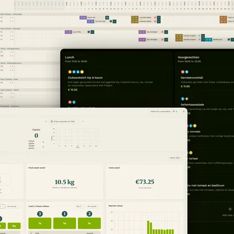
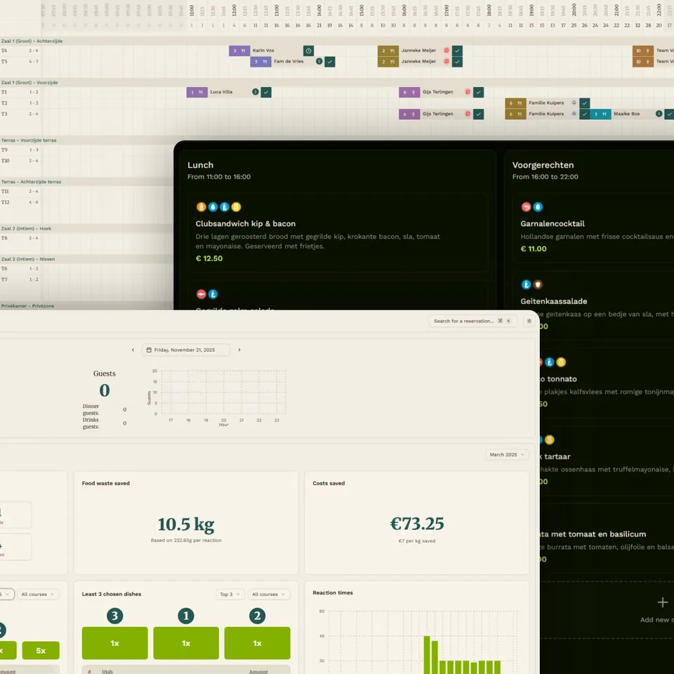
A quick summary
When I got put on Waste Warrior as a front-end developer the app left a lot to be desired, visually, but mostly functionally. The plan was to build out the app into a state where restaurants could actually start using it, and profiting from the platform. The process to get to that point was a bumpy road, but a very rewarding one.
We as a team managed to pull Waste Warrior up from a sub-par proof-of-concept application to a fully-fledged data-driven application with a bunch of features that we are very proud of.
The reservation flow after the rebuild. Captions sit in the margin, flush against the image.
Placeholder image
Where we started
Placeholder text
Long passages are set at 20 pixels on 30, which puts about sixty-six characters on a line. That is the measure book typographers have used for centuries: short enough that the eye finds the next line without effort, long enough that sentences do not break into fragments.
A margin note. Asides live beside the line they belong to instead of at the bottom of the page, so reading never has to jump.
Paragraphs are separated by one full line of space rather than an indent, which suits scrolling better than print conventions do. Headings get two lines of space above and hang in the margin, so the text column stays one unbroken ribbon of reading.
Placeholder quote. A block quote is indented, set in italic at body size, and carries no quotation marks of its own except one opening mark that hangs outside the column.
What we built
A code sample, when one is needed, keeps the same left edge as the text. There is no box around it: hairlines above and below, line numbers in a quiet grey, and the file name in the margin.
reservations.ts
TypeScript
1// expected waste per service, in kilograms2const waste = reservations3 .flatMap((r) => r.preOrders)4 .reduce((kg, dish) => kg + dish.expectedWaste, 0);Sources
- RelatedLead Trackeranother case study on this site